Visual connections
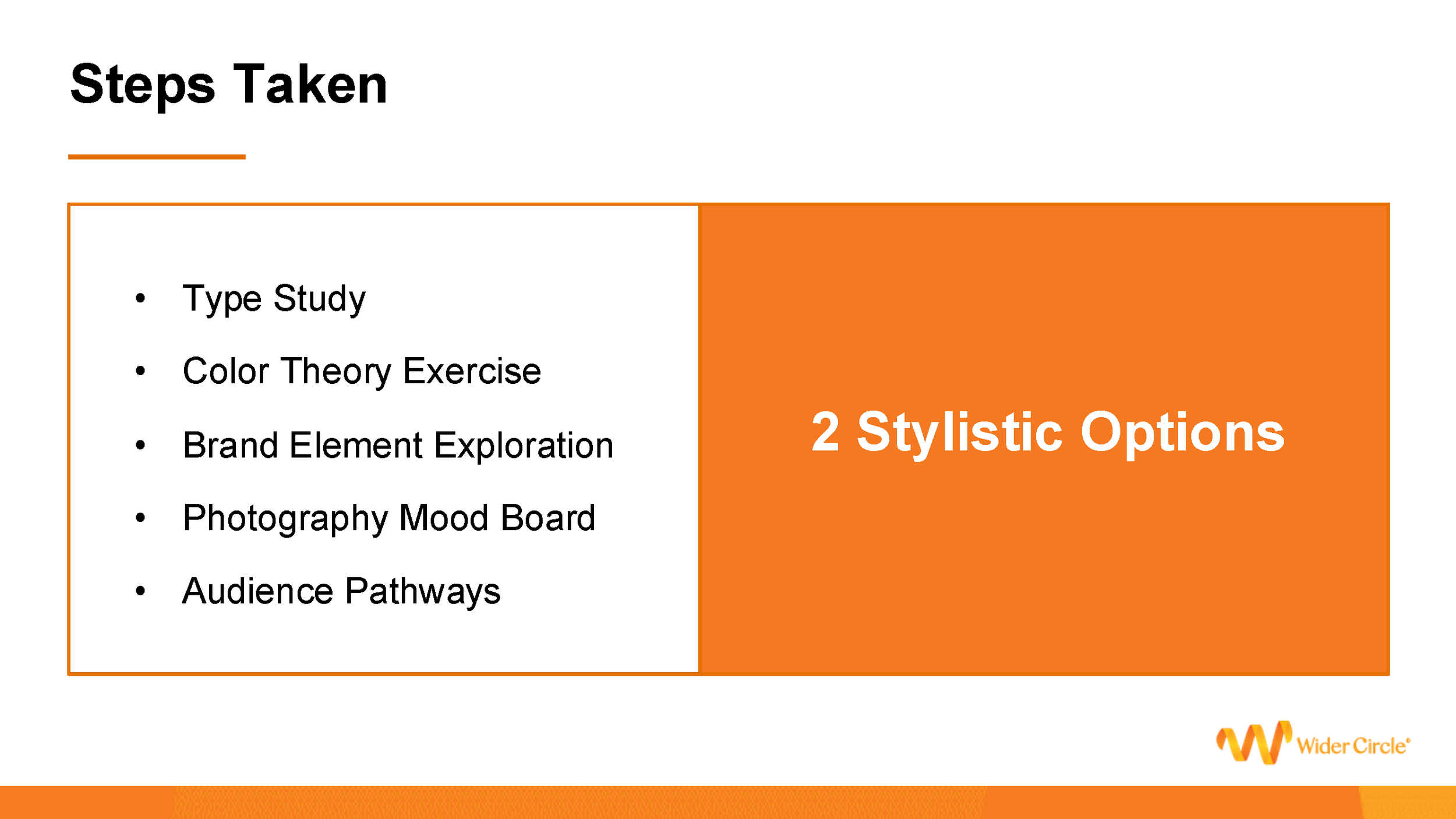
When joining Wider Circle, the first thing I wanted to do was a pitch for updated branding. Things felt outdated and disjointed for Wider Circle’s current and expanding audiences. To start, I took a look at the logo. Wider Circle has a mostly elderly customer base. Not only was the typeface and the ribbon style W not jiving, but the serif font was thin and decidedly more difficult to read for people in their later years. I conducted a type study to find options more readable for this group of people. Montserrat and Open Sans gave Wider Circle a more cohesive logo, and raised readability across all materials.
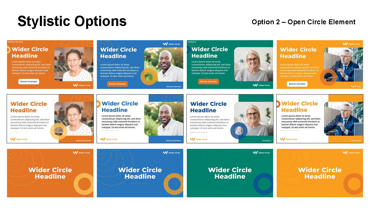
Next came a color theory exercise. Wider Circle’s colors clashed, with many not even being used in current materials. I made sure to find colors that reflected feelings that aligned with the company goals and how they wanted their customers to feel when interacting with Wider Circle. With the typeface and colors in place, I explored brand element options. These included some updates to what Wider Circle currently had in place, some more modern looking shapes, and an organic and symbolic representation of the company itself. After solidifying photography standards, everything came together into two options for leadership to decide upon.
Option 1 was selected, brand guidelines were built out and those assets and guidelines were used to influence the design of a new website and mobile application.
branding • logo • identity